 This tutorial provides a simple walk-through of most of the features of Taurus CalendarMaker, using both pre-defined templates and creating your own template from scratch. Starting CalendarMaker and Loading a Template On Unix (including Linux) Mac users need to enter the command contained in the file
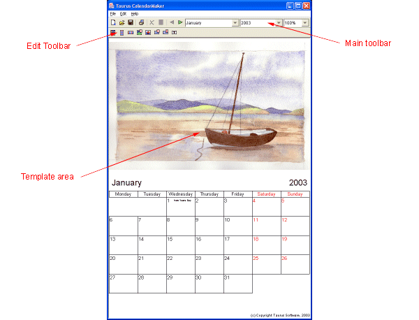
This tutorial currently only uses screenshots from Windows. The actual screens you see may vary depending upon your platform. The Main Window
The main toolbar (Figure 2) contains icons for creating new, opening existing and saving the current template. It also contains icons for opening the print dialog, deleting the current selection, editing the properties of the current selection, and navigating backwards and forwards through the months of the year. Finally there are combo (drop-down) boxes for changing the current month and year and selecting a zoom setting. We will look at the edit toolbar later.
Navigating between Months and Years Another way to change the month is to use the month drop-down (the lefthand one) to select a month by name. The month names will be specific to the locale setting for your machine, but I will use the English names throughout this tutorial. Try picking one now. Again the template will be updated to reflect your choice. You may want to print a calendar for another year (typically you will be doing this in November/December and you will want to print a calendar for the next year). To do this, simply use the year drop-down (the middle one) to pick another year. The next five years from the current date are shown (CalendarMaker does not expire after five years of use!). Structure of a Template
The standard beans are: an image bean, which shows a different picture for each month of the year; beans to show the name of the month and the year; three beans showing calendars in different formats; a static (unchanging) image bean for showing things like logos and a static text bean for user-definable text. Customizing the Images Used To start customizing, double-click the image in the default template, or
click on the properties button
To change an image, click on the filename (in the Image column) and either type a new filename, or more simply click on the "..." button, which will open a standard file chooser dialog. Figure 5 shows what the editor looks like after the filename has been clicked on.
Using the file chooser, navigate to a folder containing some pictures and
pick one. You can show all files (by selecting a different file filter), if
your images have a file extension other than Another quick way of changing images is to drag an image file from a file manager (e.g. Windows Explorer or My Computer) onto the MonthImage bean in the template. The border of the MonthImage bean will change to blue when you are over it, dropping the file will then cause CalendarMaker to assign that image file to the current month, and the image will be displayed. Customizing Fonts and Colours
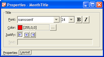
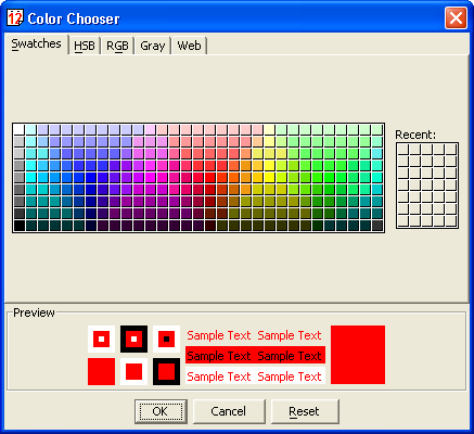
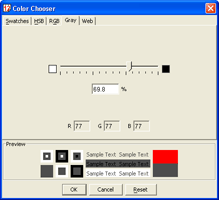
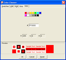
Changing the font is straight-forward. Simply pick a new font family from the left-most drop-down, a font style (bold, italic or both) from the middle box and the font size from the right-most combo. Note that if the font size you want is not listed, then you can simply type it into the box and press enter. Changes happen immediately and the title box will resize to fit the longest month's name. Why not try increasing the font size to 72 pt to see what happens. Changing the colour is marginally more complicated. The current colour is shown in the box, along with its red, green and blue values (each ranging from 0 to 255). The "..." button opens a colour picker (see Figure 7), which lets you select colours in five different ways: Swatches, HSB, RGB, Grey and Web. Normally the Swatches chooser is the one you want, and you simply click on a colour you like the look of, but the others can be useful for picking precise colours. You can use several in combination and typically you might pick a colour from Swatches, then vary the Hue/Saturation/Brilliance to get the colour you want.
Another useful feature of Swatches is that it remembers recently used colours, which can be useful for achieving a consistent colour scheme. Grey is used for picking precise greyscale values, and Web is used for entering colours in the form #RRGGBB as in HTML. Note that the template will not be updated until you click OK on the chooser.
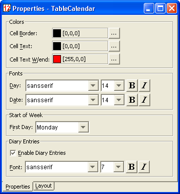
If you are not happy with the fonts and colours used in the other beans, then you can change them in the same way. The calendar beans are slightly more complicated than the title beans in that they have several colours and font settings which can be changed. Figure 10 shows the properties for a calendar bean.
The cell border colour governs the colours of the lines around each cell in the table (or lines between the rows in a list calendar). Change it to white if you don't want the lines to show. The two cell text colours govern the colours of all the text in the calendar bean. The first is the colour for weekdays and the second the colour for the weekends, allowing you to highlight Saturdays and Sundays in a different colour if you wish (the default is weekdays in black, weekends in red). Fonts are broken down into three settings, which control the font used for different parts of the calendar bean's display. The Day font is used for each of the days of the week across the top of the table (or down the side in a list calendar). The Date font setting controls the font used for the numeric day numbers. The Diary font controls the (optional) display of significant dates (e.g St.Valentines Day) and national holidays. All the font settings are slightly peculiar in that the calendar bean will not be resized to fit the fonts used. Instead the fonts are shrunk to fit the available width, whilst trying to use a font size as near the requested size as possible. This can be slightly confusing, but ensures that the text remains visible, without being clipped (the Diary font is an exception, as the length of these entries is unlimited, so it is up to you to choose a suitable size). Other Properties Remaining with the Title beans, select the copyright notice at the bottom of the template. This is a StaticTitle bean, and displays an unchanging text string, regardless of the month. Simply type the text you want to appear into the "Text" box. Now lets take a closer look at some of the properties common to the table and list calendar beans. You can turn diary entries on and off using the "Enable Diary Entries" checkbox. This is useful when working with small calendars and you don't want them cluttering the display. When you turn them off the "Font" setting becomes disabled. (Note: The panorama calendar bean does not have the space to support diary entries, so they are permanently turned off). One final property, which is only available on the table calendar, is the ability to change the day that the week starts on. By default, this will be set to whatever Java's idea of the start of the week is for your locale (in the U.S. this is Sunday, in Europe this is usually Monday, and for some bizarre reason is also Monday for the U.K, which is debatable!). The most logical settings are Sunday or Monday, but you can actually start the week on any day you wish, so if you have an aversion to Mondays, why not start the week on a Tuesday for a change! Changing the Page Size Select
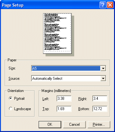
Now choose another paper size from the list and/or adjust the margins. If
you have more than one printer installed, you may need to use the printer
button to select the appropriate printer before the paper size is available to
you. Once you click If you adjusted the page size, you will notice that the template retained its proportions, even though the page changed size and/or aspect ratio. This is because the default templates employ a "layout manager" to keep things looking right. Layout managers will be explained later. Note that the Panorama Calendar template is designed for a landscape page, and will look a little odd if you select portrait. Loading and Saving Opening a previously saved template is done using either
Printing The List and Panorama Calendar Templates The List Calendar template is different in that it prints two months to a page, which you would then cut in half vertically to make the long narrow format. Note that the design is done as though there is only one month on a long narrow (half width) page, but the printing is doubled up to fill the page using the next month in sequence. To create a List Calendar go to
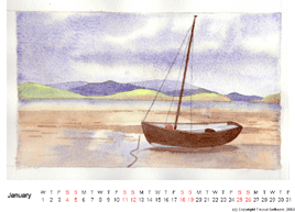
The structure of the template is similar to the table calendar, except that we now have a list calendar bean which occupies most of the lower portion of the page. Everything else is as it was before, and all the beans can be customized exactly the same way. The Panorama Calendar template is designed for a landscape page and is typically used to show landscape pictures at their maximum size, and in particular is intended for use with panoramic photographs taken with an APS camera, or multiple photographs stitched together in an image editing program, which are long and thin.
To create a Panorama Calendar, select The Coversheet Template
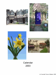
The coversheet template uses a different bean, StaticImage, which shows the same image regardless of the current month. You can change the images by using the "..." button of the Filename property in the Property Editor, on each of the beans. Creating a New Template Select We will now use the Edit toolbar (see Figure 15) to add beans to the page. All the beans which respond to the current date have a red 'D' in the top-right corner of their icon, except for the three lefthand buttons, which are the calendar beans, and are implicitly dateable. The beans are grouped, from left-to-right into calendars, images and titles.
The main part of any calendar is the calendar bean itself, so click on
either ListCalendar
You should now have a calendar bean somewhere on your page, and this bean should be selected (have a black bounding box with drag handles on it - see Figure 16). You can now move or resize this box how you want it. To move the bean, click anywhere in the center and drag it to its new position. The bean will move as you drag. To resize the bean, grab one of the handles and drag it. The bean will resize as you do so. The side handles resize in either width or height only, whilst the corner handles resize in both directions at once. You can do this as many times as you like until you are happy with it (even if you are not, you can always come back later and move/resize it again).
If you are happy with the shape of a bean, and just want to make it bigger
or smaller, hold down the Now add a MonthImage Next, you may wish to add MonthTitle
As a finishing touch, you may wish to add a copyright notice, or similar
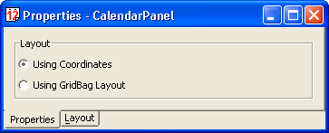
credit using the StaticTitle All that is left is to fine tune the positions so that everything lines up. Using Coordinates To specify the coordinates of a bean, first select it, then go to the
Properties dialog and select the
Now change the coordinates so that things line up (by having the same X- or Y-coordinate) or are the same size (by having the same width or height). This should produce a neater, more accurate layout than is possible by positioning things by hand. "But can't I automate this?", I hear you cry. Well, yes, of course you can. That's what layout managers are for! - and we will come onto those in a moment. If you do want to use coordinates to layout your template, then one useful
tool is the padlock button. This locks the aspect-ratio of the bean, and makes
sure that no matter how you resize the bean, be it by dragging the handles, or
typing a new width or height into the Property Editor, the proportions are
preserved. By default it is in the unlocked state
If you don't have a steady hand with the mouse, you can also use the
keyboard to fine tune your layout. The cursor-keys can be used to nudge the
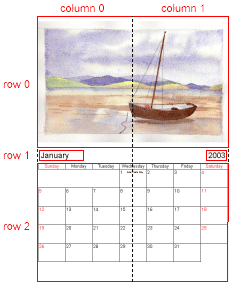
selection one pixel at a time. By holding down the Using a Layout Manager Enter the GridBag layout. This is actually a Java layout manager, which has been "borrowed" for the purpose - mainly because it is the most powerful and flexible. If you have used Java and know how to use one, then you can skip ahead a little, if not read on. GridBag works by dividing the page up into a grid. The grid does not have to have equally spaced rows and columns, but rows and columns do completely cover the page from one side to the other. Beans can be placed into the cells of this grid, and they can span more than one row or column. In this sense it is rather like a spreadsheet or a table in Word (or HTML for that matter). In addition to this beans can be anchored to one corner or side of a cell, or they can be set to fill a cell (or set of cells) horizontally, vertically or both. Figure 18 shows the grid overlaid onto the table calendar template we were using earlier. The dotted line shows the grid, whilst the red lines show the bounds of the beans. The rows and columns have been numbered for clarity.
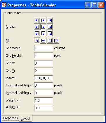
You can clearly see how the MonthImage and TableCalendar beans span (and fill) two columns. You can also see how the MonthTitle and YearTitle beans occupy just a single cell, but are anchored to the left- and righthand sides respectively. To specify where each bean appears on the page using GridBag layout, each bean has its own set of layout properties. These properties consist of the X position (start column), Y position (start row), width (in columns) and height (in rows) of the bean. In addition to the grid properties, there is an anchor (specified as a compass point), which controls where in the cell(s) the bean will appear, and a fill setting, which controls whether the bean will be stretched to fit the cell(s) and in which direction(s). Figure 19 shows the properties for the MonthImage bean, which occupies the upper portion of the template page.
As you can see, the MonthImage bean has been positioned as row 0, column 0 and has been given a width of 2 columns and height of 1 column. As our grid has 2 columns (the number of rows and columns is determined from the maximum index used between all the beans on the page), this, coupled with fill setting of "Both", means that it occupies the full width of the page. The other settings on the property sheet provide some finer control over the spacing in and around the bean. The weight properties govern the size of the rows and columns, and have values between 0.0 and 1.0. A value of 0.0 indicates that the row or column should be no taller/wider than its tallest/widest member. In the grid above, both title beans have a Y weight of 0.0, making row 1 just big enough to take the two beans. A value of 1.0 means that it will take up all available spare space. If two or more rows/columns have a weight of 1.0, then the space will be divided equally between them. This is how the MonthImage and TableCalendar in our example have been setup. To create other spacing effects, you can use a value between 0.0 and 1.0. For example, in the list calendar template, the MonthImage bean has a Y weight of 0.6, thus reducing the proportion of the page it takes up (there is no need to increase the weight applied to the list calendar at the bottom though). Don't worry if you don't quite grasp all that first time - I didn't! It helps to play with the values a bit and see what happens. The Insets property allows you to place some margins around your beans. In our table calendar template, margins of 8 pixels all round have been placed around the bean (this is why the row is slightly taller than the bean). The Internal Padding properties currently do nothing, but they are typically used to make beans with borders slightly bigger than their contents dictate. In the future there will very likely be beans which use these settings. Changing to GridBag Layout
Note that the default templates do NOT let you change the layout - they are designed to cope with different page sizes. You can only change the layout on blank calendars. Go Make Calendars... If you have any comments or suggestions about this tutorial, then please email them to me at the address below. Your feedback is important to the development of this project. Last updated 6th March 2003 Comments support |
|
||||||||
|
|
||||||||
 |
||||||||
 and
previous month
and
previous month  buttons. Notice how the image in the template area changes for each month and
how the table at the bottom is updated to show the correct days for that month.
buttons. Notice how the image in the template area changes for each month and
how the table at the bottom is updated to show the correct days for that month.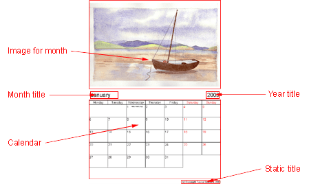
 in the main toolbar. A Properties dialog will appear containing the properties
for the MonthImage bean. These consist of a table of months and images, as
shown in Figure 4.
in the main toolbar. A Properties dialog will appear containing the properties
for the MonthImage bean. These consist of a table of months and images, as
shown in Figure 4.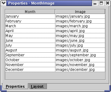
 icon. This will open the usual save dialog and you can save your work wherever
you wish. Note that the file extension used by CalendarMaker can be either
icon. This will open the usual save dialog and you can save your work wherever
you wish. Note that the file extension used by CalendarMaker can be either
 icon.
icon. icon and the usual print dialog will appear. Select your printer and settings
as normal and click
icon and the usual print dialog will appear. Select your printer and settings
as normal and click 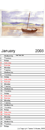
 icon. This will create a new
completely blank calendar template for you to work on.
icon. This will create a new
completely blank calendar template for you to work on.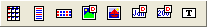
 ,
TableCalendar
,
TableCalendar  or
PanoramaCalendar
or
PanoramaCalendar  . Notice
how the button stays selected. Now click on the page where you want the
top-left corner of the new bean to appear. The toolbar button will now be
deselected.
. Notice
how the button stays selected. Now click on the page where you want the
top-left corner of the new bean to appear. The toolbar button will now be
deselected.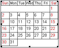
 and
position it on the page. Notice how the image is resized to fit the width or
height of the bean (whichever is smallest). Unlike some programs, there is no
degradation in image quality as you do this - the original image is simply
scaled to fit.
and
position it on the page. Notice how the image is resized to fit the width or
height of the bean (whichever is smallest). Unlike some programs, there is no
degradation in image quality as you do this - the original image is simply
scaled to fit. and YearTitle
 beans to indicate which
month the page is for.
beans to indicate which
month the page is for. bean. If you have a logo or some such graphic, you can add that to the page
using the StaticImage
bean. If you have a logo or some such graphic, you can add that to the page
using the StaticImage  bean.
bean.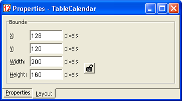
 , and when clicked, will
change to the locked state
, and when clicked, will
change to the locked state  .
This setting is remembered for each bean, and will remain set even if you edit
another bean and the come back.
.
This setting is remembered for each bean, and will remain set even if you edit
another bean and the come back.